Monday, 30 September 2013

Week 11: Penang Street Art (A picture a day)


Children On Swings

Kids Playing Basketball


Boat

Old Man

Art Is Dying

Old Motorcycle

Lucky Cat Mural

Marching Cats

These photos were taken by me during my trip to Georgetown, Penang in Malaysia this year. These street arts were done by Lithuanian artist Ernest Zacharevic. He leaves his mark with beautiful wall paintings of children all across historical Georgetown. The artworks are funny, fascinating and very much open to anybody's interpretations. These unique painting walls mimic life in the city and the wrought-iron caricatures with anecdotal descriptions of the streets they adore. 

I was intrigued by the newly transformed street scape of Georgetown. Taking photographs of these wall murals was one of my main objectives for travelling to Penang. There are around 30 artworks all over the city. I managed to find only some of them, but not all. Some of the artworks have deteriorated due to wear and tear, such as "Boat"  and "Old Man" from my photos above. 

From tiny paintings of marching cats and gigantic portraits painted on the side of a  building to turning abandoned bikes and unwanted clothes into real life 3-D street art, there was literally a treat hiding on every corner. You needed to look up, to look down, to look closer and sometimes just take time to sit down. For me, Penang’s street art, combined with its unique history, culture and beautiful old Colonial buildings are what made my trip so wonderful. I love Penang!

Friday, 27 September 2013

Week 10: A collection of half-finished objects (A picture a day)

Kishu Vases by Maya Selway

Kishu Vases by Maya Selway

Kishu Vases by Maya Selway

Objects that seem like half-finished sketches of candle holders, vases, bowls and bottles won British designer Maya Selway second prize in the Object category of the Interieur Design Awards at the Interieur design biennale in Kortrijk, Belgium, last week.

Each object in the Kishu collection is carefully weighted at its base to support its lopsided structure. I think that the designer probably worked for a very long time to get the balance right. 

The delicate pieces are made from oxidised copper, and the vase also has a shallow silver dish for holding water. The bottles and bowls are purely decorative, but the candle holder and the vase can be used as shown in the photographs above.

I love minimalistic designs and this product design is definitely one of my favourites. From afar, it may look like a flat sculpture, but up close you can see that actually the lines used to form this 3d structure actually has some practical use. This visually appealing and practical sculpture definitely redefines what a 'vas' actually is. It strays away from traditional views of what vases should be like, by making a very empty and open shape vas using copper metal, bent and smelt instead of the conventional method of using pottery clay or metal to create a "covered up" structure.

Wednesday, 25 September 2013

Week 10: Girlfriend Leads A Photographer Around the World (A picture a day)

"Follow me to" by Murad Osmann

"Follow me to" by Murad Osmann

"Follow me to" by Murad Osmann

Murad Osmann is a Russian photographer and film producer who has seen his personal photo series explode online few months ago. First it made the front page of Reddit, eventually spreading outwards to the likes of Mashable and other publications.

The story goes that Osmann’s girlfriend, Nataly Zakharova, was getting tired of him always being preoccupied with his camera, literally resorting to dragging him by the hand to keep moving. This lead to the perspective we see in each shot of the series as shown above. Some may find the photos a little ‘too’ over-processed, the concept is playful and a creative way to capture different places around the world.

This series isi titled “Follow Me,” and features a unique perpective: each shot is from Osmann’s point of view, and shows the back of his girlfriend Nataly Zakharova’s body as she leads him by the hand through various locations around the world. Regarding the look of the images: Osmann snaps the photos with his iPhone or DSLR, adds various effects to them using Camera+, and then uploads them to Instagram.

I love this idea of the photography as it creates a nice perspective through the eyes of the person behind the one leading the way. Photography intrigues me but I have never been a good photographer. Most of my photographs are amateurish which I take with my iPhone and upload it onto instagram #lionel_chingly after editing it with iOS applications such as Photowonder.

Next time when I have save enough money, I would want to buy a DSLR, and travel around the world, capturing moments with my lenses. I was never good at taking photographs of people. I enjoy taking pictures of still life such as scenery, buildings and nature. I cannot wait for my chance to take an elective module in NAFA under photography. I want to learn the basics of photography as I know it will help to make me a better Graphic Designer in the future.

Monday, 23 September 2013

Week 10: Animal heads human bodies illustration by Erica il Cane (A picture a day)

Artwork by Erica il Cane

Artwork by Erica il Cane

Artwork by Erica il Cane

Artwork by Erica il Cane

I was first introduced to this artist's works by my 2d-fundmental teacher Ms Joey Soh as a reference to my A2 size individual project painting. I chose one of the four topics which was 'Carnival'. I initially drew animal heads on human-like bodies, and after the teacher saw my works, she provided me with this artist's name for reference.

Bears, possums, otters, rabbits name any animal, and Erica il Cane has likely painted it. It is unknown why he named himself Erica il Cane (Erica the dog), but an animalistic name seems fitting. His creatures are anthropomorphized like many of the animal subjects found in contemporary art, but his approach appears vintage and illustrative, and his narratives are always intentionally mysterious. The pictures have dark undertones. On the back wall of the gallery, he painted a rabbit slipping into a noose. But some humour seeps through in other works.

I will be adding some of his style onto my A2 size painting. I hope that my painting will be turn out fine and that the teacher will like it. I chose to implement animal heads on human bodies for my theme 'Carnival' because I want to juxtapose the relationship of animals and human in a circus together. A contrast between animals, and human, both coexisting in one entity, yet bringing out the characteristics of both elements.

Friday, 20 September 2013

Week 9: Ring Clock (A picture a day)

Ring Clock by Gusztav Szikszai 

Ring Clock by Gusztav Szikszai 

Ring Clock by Gusztav Szikszai 

Ring Clock by Gusztav Szikszai 

Ring Clock by Gusztav Szikszai 

The innovative Ring Clock was originally nothing more than a viral product concept a few years ago. However, designer Gusztav Szikszai is now looking to bring the concept to market as demanded by the fans.

The ring is constructed from durable, surgical-grade stainless steel, and is comprised of three rotating rings that will display the hour, minute and seconds through the use of either blue or orange LED lights. The Ring Clock is equipped with a rechargeable lithium polymer battery that can be charged wirelessly (when set atop the included charging dock), and will last up to a full week on just a single charge. The ring is completely water resistant, and will be available in 21 different sizes.

I love how the color of the metal and the lights on the ring complement each other to bring out a very futuristic design. I think that the design of the ring clock will revolutionise the way we view time. Currently, watches are worn on the wrist and when we need to look at the time we refer to our write. But this modern design has ignored social stereotypes of viewing the time from our watch, and has taken it to the next level by putting it on our finger. Not only the ring is visually appealing, it is also very practical. I believe in the future there would be even more changes to the design, and who knows, these ring clocks might replace watches in the distant future. I definitely want one of this.


Wednesday, 18 September 2013

Week 9: Laser-cut Designer Seaweed (A picture a day)

Laser-cut Designer Seaweed

 Sakura patterns (Cherry Blossoms)


Mizutama (Water Drops)

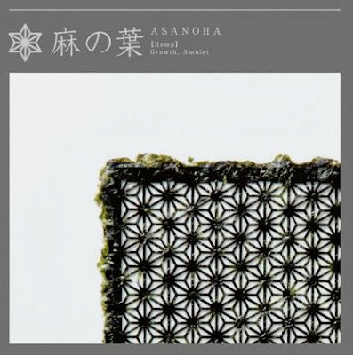
Asanoha (Hemp)

Kikkou (Turtle Seashell)

Kumikkou (Tortoise Shell)


In an effort to reinvent the cuisine, without losing the sight of the age-old tradition embedded in the culture, Japanese ad agency I&SBBDO has created laser-cut seaweed sheets for sushi.

Called ‘Unimo Seaweed’, the delicate, paper-thin sheets of ‘Nori’ (the Japanese seaweed sheets used for sushi) were laser-cut with classic Japanese pattern designs to take the sushi experience to the next level. Each decorative pattern symbolizes a notion. The Sakura patterns (Cherry Blossoms), symbolizes beauty; Mizutama (Water Drops), symbolizes luck; Asanoha (Hemp), symbolizes growth; Kikkou (Turtle Seashell) symbolizes longevity; and Kumikkou (Tortoise Shell), symbolizes long-life.

In my opnion, it is hard to think of a product that could spur less interest online than a black square of seaweed. Furthermore, the design of a square of Nori has not changed since its creation in the 15th century. I love how the juxtaposition between a modern design applied to a traditional product such as seaweed has given Japanese cuisine such as sushi rolls a very contemporary look.

I feel that choosing the right designs was also important, it is important to convey the classic brand heritage and the positive hope for the future, so that our customers could sense the values and feel more optimistic when seeing the designs. Japanese classic patterns that signify happiness, long-life, etc were used to create an unprecedented type of seaweed as a result of the combination of a traditional product with a modern laser cutter.

I love how rebranding and repackaging of a product, and giving it a new identity. This is my reason for studying Graphic Communication in NAFA. I hope that one day, my ideas will help companies boost their sales, and hopefully have my works featured in magazine and design blogs. I want to create design that is both visually appealing and practical with a good rationale.


Monday, 16 September 2013

Week 9: Dog house sofa (A picture a day)

Dog house sofa by Seungji Mun

Dog house sofa by Seungji Mun

I chose this piece of furniture cause sometimes I wonder why we must create a seperate corner just for our pets, when we can just integrate their living environment into ours. People spend a lot of time making sure their interiors look the way they want them to, only to find an ugly dog bed haunting a corner inside their home. The ‘Dog House Sofa‘ by Korean designer Seungji Mun, was made to tackle this problem with a streamlined, minimalistic piece of living room furniture.

Dogs more commonly co-existing indoors with humans. Having a separate everything for your pet seems impractical. Things such as separate bed, separate feeding stations, and sometimes even, separate doors. This may be a turnoff for people who are in the market for a new pup.

The piece is created with solid ash and canvas fabric with a cushioned side table with enough room for a small to medium sized dog to easily fit in, allowing interaction with the pet through the top of the table. 

In my opinion, the sofa cushions themselves are simple in design, which I can imagine makes for easy cleaning for all of that inevitable dog hair. As a dog lover myself, I would definitely get this sofa in the future when I can afford it. This would definitely make me feel more closer to my pets and that they are part of my home.

Friday, 13 September 2013

Week 8: Blind Divinity by EnidOhlala (A picture a day)

Blind Divinity by EnidOhlala


Blind Divinity by EnidOhlala

Not just a simple collection, but a psychedelic trip in balance between ancient Greece and steam punk suggestions. The fall/winter 2013 EnidOhlala is all this and much more. Dresses which are real three-dimensional sculptures and impressive headgear with embedded stones. A sparkling of gold, a tribute to the ancient deities who takes the name of “Blind Divinity.”

When i was young, when I looked at outrageous fashion design like these above, I would wonder "Why would anyone want to wear these on the streets?" But as i grew up and learnt more about design and fashion, I became more appreciative of such fashion design as stunning works of art. I especially love the designs above because of their symmetrical design and their three dimensional materials, complement the bronze/champagne gold colour which really brings out a very mechanical feel. They remind me of metals pipes but yet the round and circular shapes on the dress gives out a very feminine feeling despite the steam punk design. The helmet that is made out of forks radiating out and the spiky belt gives out a very funky feeling. I would love to see ideas like these in fashion to be translated into illustration art.

Wednesday, 11 September 2013

Week 8: Paper Quiling Typography (A picture a day)

2012 by Sabeena Karnik

Love Forever by Sabeena Karnik

"V" by Sabeena Karnik

My 3D-fundamental project Birthday Card Cover

Close up of my own Paper Quiling Typography for 3D-fundamental

For my first 3D-fundamental module's project, we were asked to create a card, any kind as long as it is a 3d pop-up card. Immediately I know which artists work to reference to. I saw this paper quiling typography many months back, so I decided to use this art style to decorate the cover of my Happy Birthday card. The first two photos above was quilled by Sabeena Karnik of Mumbai, India, whose on-edge alphabet started flying around the internet.

To do this paper quiling typography, you first need to outline the letters using pencil. The colors of the design is up to your own creativity. For my 3D-fundamental project, I decided to use rainbow colors from the left to right, red to violet for the individual rows of words. Next you will cut strips of paper around 5mm and use it to form the outline of the letters. I used Elmer's Glue-All multi purpose glue to glue the strips of paper onto my card. I filled up the inside of the letter using 5mm strips of colored paper of both the letters itself, and also the colors of the letter on its left and right. I used a pin need to roll the strips of paper around it to create the rolled up effect of the strips. Then i slowly adjusted the width of the roll ups and curls, and cut them according to my preference. 

The whole process took many hours for me to finish up. But when I did complete my card, I achieved a sense of accomplishment. I would definitely use this idea to create Birthday cards for my friends next time. It also helped me to train my patience and improved on my handicraft skills.


Monday, 9 September 2013

Week 8: National Library of Belarus (A picture a day)

National Library of Belarus day time view

National Library of Belarus night time view

National Library of Belarus night time view

Image of a rhombicuboctahedron


I chose these photographs because I love modern architecture. The photos above are taken from the National Library, Minsk, Belarus. In 1989 an international contest took place for the new national library building of Belarus. Architects M.K. Vinogrdov and V.V. Kramarenko and their project “Belarusian Diamond” won this contest, but it took 13 years till the project was fulfilled.4 The new library is 72 metre (236 feet) tall and has 22 floors. The building also features a 500 seat conference hall. Main architectural component has the shape of a rhombicuboctahedron. 

The National Library of Belarus, having informative resources of 8 million units on different kinds of media, is the main informative and cultural centre of the country. The library has 90 thousand users, annually serving 3.5 million documents. Every day the library is visited by more than 2.2 thousand people. Actually, the new modern building is just one of the six library buildings.

I feel that the building uses the lights to really enhance the whole structure and gives it a very futuristic view. National Library of Belarus is probably the most famous modern building in whole Belarus. The money for library was gathered from the income-tax of people. In my opinion, I think that it was better to use it for social status development. Nevertheless, it is a stunning piece of modern architecture which I would love to visit in the future when I am more financially independent.

Friday, 6 September 2013

Week 7: Made in Singapore - Three Quarters of a Century


Ang Sookoon, The Waves/Waifs, 2009, Wood, strings, artifical hair
Ang Sookoon is a Singaporean artist. This was one of her works that was diplayed in NAFA gallery. I think that she is a highly talented artist. In this object installation artwork above, I feel that that is a strong feeling of juxtaposition. Perhaps it is because for her, there is no one way of seeing things. So it is important to try to see as much facets as possible to get a better picture.

I think she got her inspiration from lietrature such as Cinderella. Cinderella had blond hair but she was forced to do housework by her step-mother and step-siblings. Just like brooms which are often left in a corner, Cinderella was neglected by her family and thrown aside.

I was intriuged by this installation art because from afar they looked like normal brooms to me, but only upon closer look, I realised that they were made from wigs and artificial hair. I think having a thick long beautiful hair is a symbolism of feminity in many cultures. In this installation art, the artist has inverted the luxurious golden locks onto the dusty floor. I feel that the idea of the lush tresses against the dirty ground is a comparison of beauty and degredation. In my opinion, the artwork conjures surrealist ideas of displacement, contradiction, and metaphors to the subconscious as well as otherworldliness.


Wednesday, 4 September 2013

Week 7: Bokeh Photographs (A picture a day)

Taxi and lights

Camera

Spectacles

Scooter

In photography, bokeh is the blur or the aesthetic quality of the blur in out-of-focus areas of an image. The term comes from the Japanese word boke, which means “blur” or “haze.” Bokeh occurs for parts of the scene that lie outside the depth of field. Photographers sometimes deliberately use a shallow focus technique to create images with prominent out-of-focus regions. In simple terms, the goal is for the subject to stand out.

Bokeh is often most visible around small background highlights, such as specular reflections and light sources, which is why it is often associated with such areas. I feel that this type of photography is very interesting, and can make even the simplest objects look spontaneous and beautiful.

Looking at these type of photographs has inspired me to attempt to take these kind of photographs, to see if I can bring out the same feeling as these photographers have. I love how the out of focus background has allowed the main subject to stand out, without isolating itself from the background. These complementary relationship has created photographs that are even more stunning.

Monday, 2 September 2013

Week 7: The Scream by Edward Munch (A picture a day)

Edvard Munch
(12 December 1863 - 23 January 1944)

The Scream by Edvard Munch (1893)

Edward Munch was a Norwegian painter and printmaker who was regarded as the pioneer of the expressionist movement. He is most famous for his painting, The Scream, in oil, pastel and lithograph. The Scream was actually an alter image for Edward Munch. His artwork has a typical trait to portray the world solely from one subjective perspective, distorting it radically for emotional effect in order to evoke emotions or ideas. Edward Munch sought to express meaning or emotional experience rather than physical activity in his expressionist paintings.

His painting“The Scream”depicts a man in a private moment of anguished, despair and anxiety. There are four coloured versions and a black and white lithographic stone version of The Scream. I feel that painting is a mode of creative expression and the forms are numerous. These can be seen from the art movement, which has shown the different ways ideas and emotions can be portrayed in paintings.

I love how this painting is enriched with feelings using brushstrokes and the distorting effect. I really makes me feel that the person is screaming and it is radiating out from the painting. I sometimes reference to fine art western paintings cause I think that it can equip me with many inspirations and ideas which I may use in the future.


Saturday, 31 August 2013

Week 6: Singapore Night Festival (A picture a day)

Singapore Night Festival at Singapore Art Museum


Singapore Night Festival at Singapore Art Museum

These photos are taken at the Singapore Art Museum for Singapore Night Festival 2013. It is a nocturnal extravaganza held over four nights every year. This year is the sixth year for the Singapore Night Festival and it stretches from Plaza Singapura to Raffles City and from Waterloo and Armenian streets to Fort Canning Park. It is organised by the team at the National Museum of Singapore.

There are many aerial performances, music, dance and installation artworks in many museums around Singapore such as the Singapore Art Museum, Peranakan Museum and the National Museum of Singapore. My favourite part of the Singapore Night Festival is the video mapping prologue which introduces the essence of instrument, showing how visuals and sounds combined with each other to establish a relationship between architecture and people. The outside of the museums were filled photography enthusiasts who set up their big cameras and tripods and parked them at strategic spots.

I think that the Singapore Night Festival is a good way for people to immerse themselves in a vibrant showcase of heritage, arts and culture in Singapore. I only heard of the Singapore Night Festival last year, and I had a really fun experience then, so I decided to go again this year. And it definitely proved to be worthwhile. I cannot wait for next year's showcase and I hope it would be even better.